

Light Interior Paint Colors That Make Your Home Feel Fresh
There’s nothing quite like walking into a room that feels light, calm, and airy—especially in our Florida sunshine. If your home is starting to feel a little heavy or dated, the right paint color can work magic without changing anything else. Think of it as a fresh filter for your walls.
For homeowners thinking about everyday enjoyment, resale appeal, or simply making a familiar space feel new again, light interior paint colors are one of the easiest upgrades to consider. They can help rooms feel cleaner, brighter, and more open without the cost or disruption of a full renovation. In a Florida home, where natural light is often one of the property’s best features, the right shade can make that sunshine work even harder for you.
Why Light Paint Colors Work So Well in Florida Homes
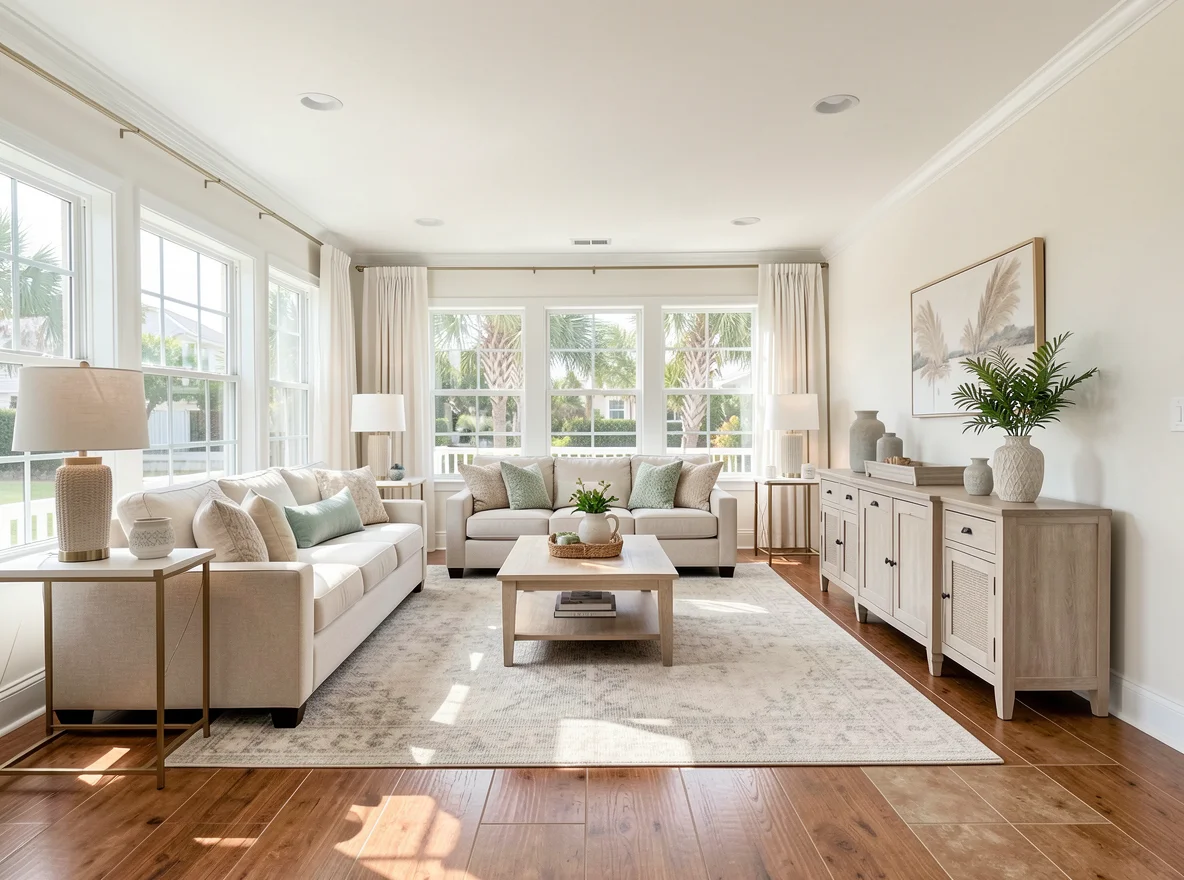
When we talk about “light” paint colors, we’re not just talking about plain white. There’s a whole world of soft neutrals and gentle tints that can brighten a room without making it feel cold or sterile. Warm whites with a hint of cream, pale greiges, and soft blues or greens can all bounce light around and make a space feel more open.
That matters in Florida, where sunlight can be intense, beautiful, and constantly changing throughout the day. A room that gets bright morning light may feel completely different by late afternoon, and paint colors respond to every shift. Lighter shades tend to reflect more of that natural light, helping spaces feel fresh instead of closed in. They can also soften the look of older finishes and make a home feel more current without changing the layout, flooring, or cabinetry.
From a real estate perspective, lighter interiors also tend to photograph well and appeal to a wider range of buyers. Even if you are not planning to sell anytime soon, choosing colors that feel clean and welcoming can make your home easier to live in now and easier to present later.
Look at Your Existing Finishes Before You Choose a Shade
Before you pick a color, take a look at what’s already in the room—your floors, cabinets, and big furniture. Paint never lives on the wall by itself. It is always in conversation with the fixed elements around it, and that is where many homeowners get tripped up.
If you have warm finishes like tan tile, honey-toned wood, beige countertops, or creamy trim, a warm white or light greige will usually play more nicely than a stark, cool white. Cooler whites can sometimes make warm finishes look more yellow than you intended. On the other hand, if your home has gray tile, cooler-toned stone, crisp black accents, or modern finishes, a soft gray, blue-gray, or cooler neutral may feel more natural and balanced.
This is especially important in open-concept homes, where one paint color may be visible from the kitchen, dining area, and living room all at once. A shade that looks lovely in isolation can feel disconnected if it fights with the undertones in your flooring or cabinets. The goal is not perfection. The goal is harmony.
If you are unsure what undertone you are seeing, compare a few paint chips side by side against your cabinets, counters, and flooring in daylight. Often, the right direction becomes much clearer when you stop looking at the wall alone and start looking at the whole room together.
Sampling Paint Is the Step You Should Never Skip
Sampling is your best friend here. Instead of committing to a whole gallon right away, brush a few sample colors on the wall in at least two spots: one where the room gets the most natural light, and one where it’s more shaded. Look at them throughout the day—morning, afternoon, and evening. Florida light can change quickly, and what looks perfect at noon might feel very different at 7 p.m.
This step may feel small, but it can save you from expensive frustration. A color that reads soft and creamy in the store may suddenly look too yellow in direct sun. A pale gray that seemed elegant on the sample card may turn flat or chilly in a darker corner. Paint is one of those decisions that really needs to be tested in real life, in your own home, under your own lighting.
It also helps to sample on more than one wall if the room has multiple exposures. North-facing light, west-facing light, and artificial evening light all affect color differently. Live with the samples for a day or two before deciding. That little bit of patience usually leads to a result you will be much happier with.
The Best Rooms to Start With
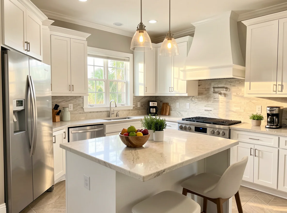
If you’re not sure where to start, hallways, living rooms, and kitchens are great candidates for a light, neutral color that can flow from space to space. These are often the most visible and most frequently used areas of the home, so even a simple paint refresh can have a big impact.
Hallways benefit from lighter colors because they often have less natural light and can feel narrow if the walls are too dark. Living rooms are ideal because they are gathering spaces, and a soft neutral backdrop makes the room feel more relaxed and versatile. Kitchens also respond beautifully to lighter paint, especially when you want the space to feel cleaner, brighter, and more updated without replacing cabinets or counters.
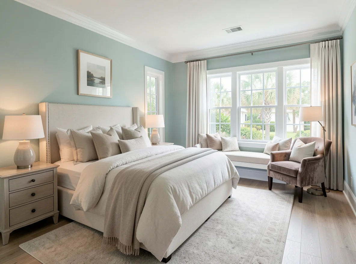
Bedrooms can handle a little more personality. A whisper-soft blue, green, or blush can still feel light and fresh while adding a touch of coziness. The goal isn’t to match every room exactly, but to create a family of colors that feel like they belong together. That sense of flow makes a home feel more intentional and peaceful.
If you are repainting in stages, begin with the room you use the most. That gives you the biggest day-to-day reward and helps you build confidence before moving on to the next space.
Don’t Overlook Trim, Doors, and the Details
Don’t forget the trim and doors. Freshening up baseboards, door frames, and interior doors in a clean, bright white can make your existing wall color look better—even before you repaint the walls. Sometimes just cleaning up the trim and touching up scuffs is enough to give your home a more polished, cared-for feel.
This is one of the most underrated ways to make a home feel fresher. Over time, trim collects dings, fingerprints, and wear that subtly age a room. Even if your wall color is still working, tired trim can make the whole space feel less crisp. A fresh coat on the details can sharpen everything around it.
Interior doors are worth attention too. Repainting doors in a consistent white can make a home feel more cohesive, especially if different rooms have been updated at different times. It is a relatively small project, but it can create a noticeably cleaner overall impression.
Choose Colors That Make You Exhale
Most importantly, choose colors that make you exhale when you walk in. This is your home, not a showroom. If a soft sandy beige reminds you of the beach, or a gentle green makes you think of a peaceful garden, that’s a sign you’re on the right track.
It is easy to get caught up in trends, paint names, and what looks good online. But the best color for your home is the one that feels right in your space and supports the way you want to live. Some homeowners want bright and breezy. Others want soft and restful. Both can be achieved with light colors if you pay attention to undertones, lighting, and the mood you want to create.
You don’t have to repaint everything at once—start with the room you use the most and let the rest follow when you’re ready. A few cans of paint, a weekend, and a little courage can make your home feel new again, without changing your address.
If you are preparing your home for sale, thoughtful paint choices can also help buyers see the space as fresh, well cared for, and move-in ready. And if you are staying put, the payoff is just as meaningful: rooms that feel lighter, calmer, and better suited to everyday life in the Florida sun.

